 The Good Sign Company
Checkout counter comparison
Portrait vs landscape sign holder: which orientation fits a checkout counter?
Choose portrait when a narrow counter position and a top-to-bottom message hierarchy matter most. Choose landscape when the message needs a wider line, side-by-side elements, or a lower profile. Neither orientation fixes weak copy, an obstructed sightline, or a holder that does not fit the printed insert.
This is an orientation decision for an indoor checkout message, QR prompt, policy, or promotion. If the format itself is still open, start with the broader guide to retail counter signs for checkout areas.
Disclosure: As an Amazon Associate, we may earn from qualifying purchases and approved partner referrals.
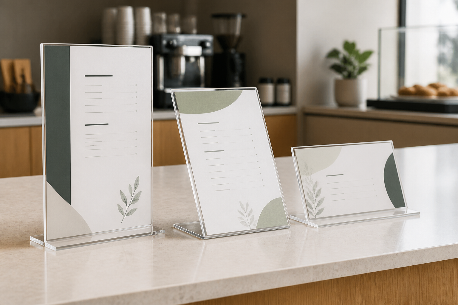
Compare holders with the finished insert in hand
Check each current listing for supported insert dimensions, portrait or landscape orientation, visible area, overall height and width, complete base footprint, loading edge, material, and care instructions. A familiar paper-size label does not establish the visible opening.
Quick comparison
| Decision | Portrait holder | Landscape holder |
|---|---|---|
| Message shape | Heading above a short stack of details | Short wide line or side-by-side elements |
| Counter footprint | Usually less width for the same nominal sheet | Usually less height but more width |
| Sightline | Can lift a heading above low objects | Can stay below monitors or staff sightlines |
| QR layout | Can stack prompt, code, and fallback | Can place a code beside concise instructions |
| Best first fit | Narrow space and vertical reading order | Wide space and a compact vertical profile |
Choose portrait for a vertical message hierarchy
Portrait is the stronger candidate when the reader should move from a short headline to one instruction, a QR code, and a brief fallback. It can preserve counter width beside a terminal, receipt printer, or product display. Print the longest normal message and confirm that every essential line remains visible above nearby objects.
The tradeoff is height. A tall holder can interrupt the staff-to-customer sightline, sit behind a monitor from one approach, or catch overhead reflections. Measure the complete holder—not only the insert—and view a full-size paper mockup from where the line actually pauses.
Choose landscape for a wider, lower layout
Landscape can suit a short promotion, concise policy, row of service options, or QR code beside its explanation. The lower profile may keep faces and equipment visible, and a wider layout can reduce awkward line breaks in a compact headline.
That width has to come from somewhere. A landscape holder may compete with payment hardware, merchandise, bags, or the customer handoff zone. It can also tempt the writer to add unnecessary copy. Reserve the entire base and panel footprint with tape before choosing.
For a QR prompt, design around the task
State what the scan does and provide a readable fallback when the task needs one. Keep the code unobstructed, preserve the clear margin supplied with the code artwork, and test the finished print with the devices and lighting at the real counter. Do not stretch, crop, decorate, or place text over the code.
If scanning is the primary decision, use the QR code counter-sign guide for destination upkeep, contrast, glare, placement, and fallback planning. Orientation comes after the task and scan route work reliably.
Setup and maintenance checks
- Write the real message. Use the longest routine headline, instruction, price, date, or fallback.
- Print both orientations at full size. Include the actual type, margins, logo, image, and QR code if used.
- Mark the complete footprint. Leave payment, service, product, cleaning, and handoff areas unobstructed.
- Walk the customer approach. Check the message where people first need it and where the line waits.
- Check light and glare. View both mockups under normal operating conditions.
- Rehearse an update. Confirm loading clearance, print ownership, replacement frequency, and source-file location.
- Clean as directed. Follow the holder maker's current care instructions.
Who should skip each option?
- Skip portrait when its height blocks staff, equipment, merchandise, or the normal customer sightline.
- Skip landscape when its width enters the payment, bagging, product, or handoff zone.
- Skip both when customers need the message before reaching the counter; use a larger or earlier placement.
- Skip both when the listing omits the insert size, visible area, orientation, base dimensions, loading method, or care details needed to verify fit.
- Pause the project when the message is accessibility-, emergency-, privacy-, lease-, or code-sensitive; the responsible organization or qualified professional should define the requirement.
Bottom line
Portrait earns its place when a narrow footprint and stacked reading order fit the checkout workflow. Landscape earns its place when a wider, lower message fits without taking over the counter. Decide with two full-size printed mockups, then verify the holder's insert opening, visible area, complete footprint, loading clearance, glare, and care guidance before ordering.
Continue with the small-business sign planning pillar, compare single- and double-sided counter signs when approach direction is unresolved, or compare L-shaped and T-shaped acrylic holder profiles when viewing faces and base geometry are next.