 The Good Sign Company
Worth-it decision
Is an L-shaped acrylic sign holder worth it for a one-way counter?
An L-shaped acrylic holder is worth considering when customers approach mainly from one direction, one printed face is enough, and the measured insert and base fit the counter. Skip it when people must read from both sides, reflections obscure the message, or staff cannot reach the loading edge without clearing the counter.
This is a sightline-and-workflow choice, not a contest for the thickest acrylic. Map the customer approach, make a full-size paper mockup, and rehearse one insert change. For the wider planning sequence, start with the small-business sign planning guide.
Disclosure: As an Amazon Associate, we may earn from qualifying purchases and approved partner referrals.
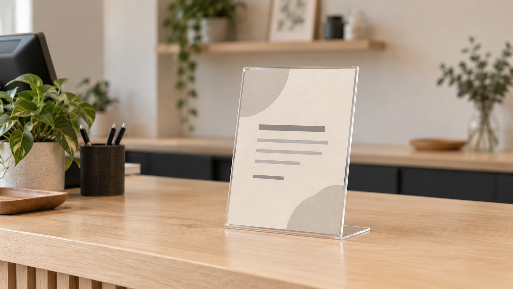
Compare holders after measuring the counter
Check the current listing for exact insert and visible dimensions, portrait or landscape orientation, loading edge, complete base depth, cleaning directions, and package quantity. Match those details to your mockup rather than assuming a familiar paper label guarantees fit.
Quick verdict: buy, skip, or delay
- Buy: one customer approach dominates, a single printed face communicates the message, and the holder fits without crowding payment or handoff space.
- Skip: people approach from opposite directions, the message must be read from behind, or a flat card already works.
- Delay: wording, paper size, orientation, counter layout, or update ownership is still changing.
- Choose another format: use a two-face holder for two approach paths, a wall-mounted notice when the counter is full, or a clipboard when staff need direct writing access.
Map the one-way sightline first
Stand where a customer first sees the counter, then trace the normal path to the point of action. An L-shaped holder makes the most sense when those positions stay on the same side of the display. If customers queue from one side but leave or browse from the other, decide whether the reverse side needs a second message before buying.
Place a folded paper mockup at the proposed location. Check it from the shortest and longest realistic viewing distances, at seated and standing eye levels when both occur. A useful holder cannot rescue type that is too small or a message hidden behind merchandise, a monitor, or countertop equipment.
Measure the whole holder, not just the insert
- Insert size: verify the listed paper dimensions and orientation.
- Visible area: keep critical words away from edges that the holder may cover or visually distort.
- Base depth: mark the complete footprint with removable paper tape, including the rearward foot.
- Loading clearance: identify the open edge and leave enough hand room to replace the insert.
- Counter workflow: preserve space for payment, bags, forms, handoffs, and needs defined for the actual business.
Glare and cleaning can change the answer
Clear acrylic can reflect windows and overhead fixtures. Test the paper mockup behind a clear sleeve or sheet from the real approach, then shift the location or angle if reflections cross the important line of text. Dark, low-contrast artwork can become harder to read through a reflective face.
Use the maker's current cleaning guidance for the holder and the counter. Place the holder away from splashes, food preparation, or cleaning routines it was not documented to handle.
How often will the message change?
An insert holder earns more of its footprint when staff reuse it for changing hours, pickup instructions, payment notes, check-in steps, or short promotions. If the message stays fixed for months, a smaller flat card, framed print, or wall sign may be simpler. If it changes several times a day, confirm that loading access is genuinely faster than the current method.
Assign one person or role to remove stale inserts. A polished holder with an outdated message is still a poor sign system.
Choose the alternative by the failed test
- Two viewing directions: compare a double-sided countertop holder.
- Frequent writing: compare a clipboard sign holder with an acrylic holder.
- Too little counter depth: consider a wall, shelf-edge, or fixture-mounted route that suits the exact surface and permissions.
- Stable premium message: a fitted card stand or custom counter sign may suit the presentation better after dimensions and current maker capabilities are verified.
A five-minute counter trial
- Write the final message at full size and print it.
- Fold scrap card into the listed overall profile and mark the base depth.
- Place it outside the payment and handoff zones.
- Read it from every real approach under normal lighting.
- Rehearse removing and replacing the insert without shifting other counter items.
If the message disappears from an important approach, the base interrupts work, or loading requires a counter reset, choose another format before ordering a multipack.
Bottom line
An L-shaped acrylic sign holder is worth it when a measured one-way sightline, compatible insert, manageable reflections, and accessible loading edge all line up. Test the footprint and message at full size, then buy only the quantity the real layout needs.
Continue with the L-shaped vs T-shaped acrylic holder comparison if two approaches may matter, the small-business sign planning pillar, or the single-sided vs double-sided counter sign comparison.