 The Good Sign Company
Display comparison
Single-pocket brochure holder vs multi-pocket literature display
Choose a single pocket when one handout supports one clear visitor action; choose multiple pockets only when readers genuinely need distinct, clearly labeled handouts in the same place. Every added stack consumes counter width, asks for another label, and creates another restocking job.
This comparison is for reception desks, service counters, and indoor event booths where printed takeaways need a visible sign or label. If the broader arrival experience is unsettled, begin with the small-business sign planning guide.
Disclosure: As an Amazon Associate, we may earn from qualifying purchases and approved partner referrals.
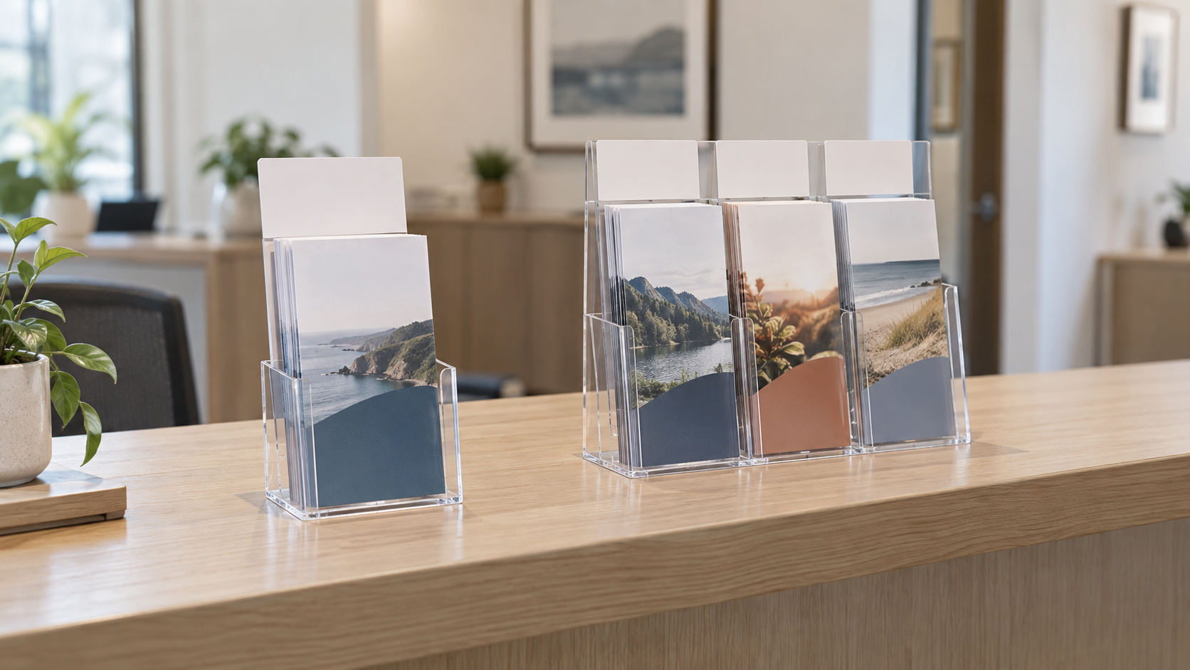
Compare the two display formats
Use actual folded handouts when checking pocket width and depth. Compare overall dimensions, visible brochure area, pocket arrangement, header space, loading access, care instructions, and included parts on the current listing.
Quick comparison
| Decision | Single pocket | Multiple pockets |
|---|---|---|
| Best fit | One brochure, form, menu, or takeaway | Several distinct handouts at one station |
| Reader choice | Fastest when one next step matters | Requires clear sorting and labels |
| Counter space | Usually narrower; verify the full base | Needs room for the entire loaded display |
| Restocking | One stack to monitor | Every pocket needs its own stock routine |
| Message | One headline names the action | A shared header and pocket labels may be needed |
Count reader decisions, not brochures
Three color versions of one visitor guide may still represent one decision and belong in one pocket. An intake form, service menu, and neighborhood map represent three different actions even if the papers share a size. Multiple pockets help only when separating those actions makes selection clearer.
Write the intended action above each proposed stack: take a form, compare services, keep directions, or learn about an event. If two stacks have the same action, consolidate them for a trial. If the labels need long explanations, revise the handouts or grouping before choosing a holder.
When one pocket is better
A single pocket works when one handout is the obvious next step after a short counter message. The header names the task while the brochure supplies details. It also gives that handout more visual space and keeps a less important stack from competing with the primary action.
- Choose it for focus: visitors should take one form, guide, or menu.
- Choose it for tight counters: the measured holder fits without displacing payment, check-in, or work space.
- Choose it for mobile setups: one stable handout travels and can be restocked predictably.
- Skip it: staff repeatedly explain that different documents are mixed in one stack.
When multiple pockets earn the footprint
A multi-pocket display earns its space when the same visitors regularly choose among several related handouts and the grouping remains stable. A reception desk might separate new-client forms, service information, and a local guide. A booth might separate wholesale details from a care card and event schedule. The pockets should reduce sorting work for the reader, not turn spare counter space into document storage.
Check whether the back row remains visible when front pockets are loaded. A taller display can improve label visibility but may interfere with conversations, monitors, or a seated sightline. Use the listed complete dimensions to build a paper silhouette before ordering.
Plan the header and pocket labels together
The shared header answers “What is this station?” Pocket labels answer “Which handout do I need?” A single-pocket holder may need only the shared headline. Multiple pockets often need both levels, especially when brochure covers look similar.
- Write one short heading that accurately covers every pocket.
- Give each stack a distinct label based on the reader's task.
- Print labels at their proposed visible size.
- Load real handouts and view the display from the approach path.
- Remove labels that merely repeat an already legible brochure title.
If the combined holder and header question is open, use the brochure-holder header-sign worth-it test.
Measure more than paper size
- Folded dimensions: measure the finished brochure, including inserts that change thickness.
- Usable pocket: verify listed width, depth, and loading direction for the exact holder.
- Visible area: check how much of the cover and title remains above the pocket face.
- Complete footprint: mark the full width and depth, not just one pocket.
- Hand clearance: leave space for readers to remove an item and staff to refill it.
- Reflections: view clear faces under the real window and overhead lighting.
Restocking can decide the format
Track one normal week before buying. Note how many copies of each handout leave, when a pocket becomes visually low, and who removes expired material. A multi-pocket display is a poor fit when only one brochure moves while the others become stale. It is also a warning sign when no one owns the review date printed on a handout.
Set a minimum stock mark outside the reader's view, store refill bundles together, and assign one role to the display. Follow the maker's cleaning instructions rather than assuming every clear material accepts the same cleaner.
Wall, counter, and event use differ
Confirm whether the exact holder is intended to stand on a counter, attach to a wall, or support both arrangements. Do not infer mounting compatibility from photos. Wall placement changes loading clearance and attachment planning; counter placement adds footprint and approach-angle constraints.
For a traveling booth, measure the packed display and decide whether brochures travel inside it or separately. A multi-pocket unit can take more packing volume than a narrow holder. Compare portable cases for booth graphics when the broader kit also travels.
Skip both formats when
- Staff must hand a situation-specific document directly to each visitor.
- Information changes so often that printed stock becomes outdated.
- A wall station or digital destination better fits the workflow.
- The counter cannot spare the measured base and hand clearance.
- Brochure covers and labels remain unreadable after a full-size trial.
If the job is displaying a replaceable notice rather than distributing takeaways, compare a clipboard sign holder with an acrylic sign holder.
A five-minute cardboard test
- Trace each candidate's listed overall width and depth on the intended surface.
- Build a silhouette to the listed total height.
- Tape real handouts at the proposed pocket positions and add paper labels.
- Walk the visitor approach, then test removal and restocking from the staff side.
- Choose the fewest pockets that keep every necessary action distinct.
Bottom line
A single-pocket brochure holder is the stronger default for one clear handout and one next step. Move to a multi-pocket literature display when measured demand supports several distinct handouts, every pocket can be labeled clearly, and the full display fits the counter and restocking routine. More pockets are useful only when they make the reader's choice easier.
Continue with the small-business sign planning pillar, compare reception desk sign holders, or use the small-studio check-in sign guide when the primary need is directing an arrival.