 The Good Sign Company
Changeable Counter-Sign Comparison
Printed counter insert vs dry-erase counter sign
A replaceable printed insert keeps type, spacing, and branding consistent, but every change depends on a file and printer. A dry-erase sign puts the update at the counter, but legibility, marker care, and cleaning become part of the shift routine. Choose by who owns the message and how it changes—not simply by which sign is faster to buy.
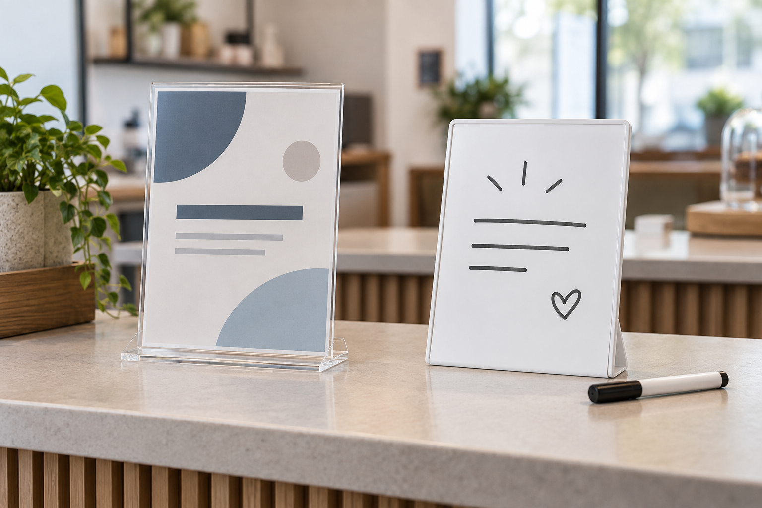
Compare the complete display
Check the update system, not only the sign face.
For a printed route, verify the holder's stated insert dimensions, orientation, loading edge, complete footprint, and cleaning guidance. For a writable route, verify the exact surface, compatible marker type, usable writing area, base or stand dimensions, and maker's erasing instructions.
The short answer
- Choose a printed insert when the message needs consistent typography, approved wording, repeat copies, or a polished brand layout.
- Choose a dry-erase sign when a trained person at the counter needs to change a short message without waiting for a printer.
- Keep a stable printed header with a writable detail area when the label stays fixed but one value—such as a room, time, or featured item—changes often.
- Skip both when the message must be seen from beyond the counter; a larger wall, hanging, or floor display may fit the sightline better.
Printed insert vs dry-erase sign at a glance
| Decision point | Replaceable printed insert | Dry-erase counter sign |
|---|---|---|
| Best fit | Approved, repeated, or visually consistent messages | Short messages changed at the point of use |
| Update work | Edit the source file, print, trim if needed, and replace the insert | Erase, clean as directed, rewrite, and return the marker |
| Presentation | Repeatable type, spacing, color, and logo placement | Handwriting varies by updater, marker, and available space |
| Supplies | Printer access, suitable paper, and possibly a cutting tool | Compatible markers, eraser or approved cleaning supplies, and marker storage |
| Common visual issue | Glare or reflections from a clear cover; incorrect print scaling | Low-contrast writing, crowded lines, or residue if care instructions are missed |
| Change control | Source file and approval path can preserve wording | Local edits are immediate but need a clear owner and writing standard |
Start with message life and update ownership
Review the last month of counter messages. Record what changed, how often, who requested it, and who physically updated the display. A printed insert usually makes sense when the same approved layout returns, several locations need matching copies, or wording must pass through a reviewer. A dry-erase surface earns its place when a local operator changes a genuinely short message often enough that printing creates avoidable delay.
Do not count every corrected typo as evidence that the sign changes frequently. That may point to a weak approval process instead. Likewise, do not choose handwriting merely because it feels flexible if staff lack the time, marker, or clear standard to keep the message readable.
Who each option fits
A printed counter insert fits teams that need:
- consistent wording and appearance across shifts or locations;
- a stored source file that can be reviewed before display;
- logos, detailed spacing, multiple type sizes, or small diagrams;
- duplicate copies for several counters;
- a predictable layout for messages that change on a planned schedule.
If this route wins, compare flexible clear menu sleeves by finished-paper fit, loading edge, holder compatibility, glare, and cleaning instructions.
A dry-erase counter sign fits teams that need:
- same-day local changes without a print handoff;
- a short message that one accountable person can rewrite;
- temporary names, times, availability notes, or featured items;
- a reusable face when handwritten presentation suits the setting;
- a simple reset routine that can be included in opening or closing tasks.
Measure the finished counter setup
Measure the full base and the space needed to load an insert or write on the surface. A holder described by paper size can still have a wider base or require clearance above or beside it. Place a paper mockup at the actual counter and view it from the customer approach, not from the staff position.
- Visible area: confirm how much of the insert or writing face remains visible after borders, clips, or a frame.
- Orientation: choose portrait for a short stacked hierarchy or landscape when one line needs width; test the real message.
- Glare: check windows and overhead lights throughout normal operating hours. Clear covers and glossy writing surfaces can both reflect.
- Footprint: include the entire base plus loading, writing, and cleaning access around payment equipment and merchandise.
- Viewing angle: make sure the face points toward the normal approach and is not hidden by a terminal, brochure holder, or product display.
Setup and maintenance tradeoffs
Printed-insert routine
- Create one correctly sized source file and record the holder's stated insert dimensions.
- Print at actual size and check trimming, margins, contrast, and orientation before replacing the live message.
- Keep the approved current file in a location the update owner can find.
- Handle and clean the holder according to its maker's guidance; do not assume every clear plastic tolerates the same cleaner.
- Remove expired inserts from the counter and archive only what the team genuinely reuses.
Dry-erase routine
- Confirm that the selected marker is compatible with the exact writing surface.
- Set a maximum line count and minimum handwriting size using the real viewing position.
- Assign the update, legibility check, and end-of-message erase to named roles.
- Store the capped marker where it returns consistently without rolling into customer or food-service space.
- Follow the manufacturer’s erasing and cleaning directions; replace depleted or damaged supplies rather than compensating with faint writing.
Claims about staining, ghosting, solvent use, food-service suitability, or surface life depend on the exact product. Follow its documentation instead of assuming all dry-erase faces or clear holders behave alike.
Run a one-week workflow test
- Write the real messages both ways at the intended finished size.
- Time the complete update—not just printing or writing—including approval, retrieval, cleanup, and returning supplies.
- Ask someone who did not create the sign to read it from the normal customer position.
- Photograph the setup at the brightest and dimmest routine conditions to reveal reflections and weak contrast.
- Note missed updates, unavailable supplies, scaling errors, hard-to-read handwriting, and counter conflicts.
- Choose the route the team can repeat reliably, then document the file location or cleaning and marker routine.
When to skip each option
- Skip a printed insert when urgent local changes are routine and reliable printer access, approved templates, or replacement ownership does not exist.
- Skip a dry-erase sign when several locations need identical wording, the message contains detailed layout, or no one owns legibility and cleanup.
- Skip a clear holder when reflections remain distracting after testing the actual position; compare a different face finish or angle rather than assuming the insert is the problem.
- Skip a small tabletop sign when customers need the information before reaching the counter or while standing beyond its readable range.
- Use a fixed sign when the wording rarely changes. A permanent message does not benefit from an update system that adds supplies and upkeep.
Next steps
If a printed route wins, compare table tents and acrylic holders by viewing faces, insert access, footprint, glare, storage, and reuse. When several similarly sized notices change on a schedule, decide whether a printed-insert system is worth the recurring workflow.
If a writable route wins, the chalk-marker board vs changeable letter board comparison covers two other manual formats, while the dry-erase schedule-sign guide is better for structured grids and recurring time slots.
For the wider decision—message, customer path, sightline, placement, approvals, and maintenance ownership—continue to the small-business sign planning pillar.